
Create Responsive Product Slider Using HTML CSS and JavaScript
Learn How To Create A Product Slider. Easy way to create Product Slider using HTML, CSS, and JavaScript. I also provide you HTML and CSS Code which helps you to understand this Tutorial.
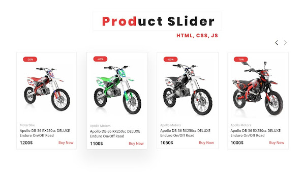
Create Responsive Product Slider Using HTML CSS and JavaScript
- 00:00 - 01:40 min : Intro
- 01:40 - 15.00 min: Learn How To Create Responsive Product Slider Using HTML CSS and JavaScript
  <!--doctype html-->
<html>

<head>

<meta charset="utf-8">
<meta name="viewport" content="width=device-width, initial-scale=1.0">

<!--==Title==================================-->
<title>Product Slider HTML - Website</title>

<!--==CSS====================================-->
<link rel="stylesheet" href="css/style.css"/>

<!--==Poppins-Font===========================-->
<link rel="preconnect" href="https://fonts.googleapis.com">
<link rel="preconnect" href="https://fonts.gstatic.com" crossorigin>
<link href="https://fonts.googleapis.com/css2?family=Poppins:ital,wght@0,100;0,200;0,300;0,400;0,500;0,600;0,700;0,800;0,900;1,100;1,200;1,300;1,400;1,500;1,600;1,700;1,800;1,900&display=swap" rel="stylesheet">

<!--==CSS-Swiper==============================-->
<link rel="stylesheet" href="css/swiper-bundle.min.css"/>

</head>

<body>

   <!--==Slider============================================-->
   <section class="product-slider">

    <!--==heading====================-->
    <h4 class="product-slider-heading">Product Slider</h4>


    <!--btns=========================-->
    <div class="slider-btns">
        <div class="swiper-button-prev"></div>
        <div class="swiper-button-next"></div>
    </div>

    <div class="slider-container">
    <!-- Swiper -->
    <div class="swiper mySwiper">
    <div class="swiper-wrapper">

        <!--1================================-->
        <div class="swiper-slide">
        <!--box----------------------->
        <div class="product-box">
            <!--==offer==-->
            <span class="product-box-offer">-20%</span>

            <!--img-container****************-->
            <div class="product-img-container">

            <!--img=============-->
            <div class="product-img">
            <a href="http://demo47.askas8.se/sv/front-brake-assy-37-5-12-14">
                <img alt="" class="product-img-front" src="images/1-a.jpg"/>
                <img alt="" class="product-img-back" src="images/1-b.jpg"/>
            </a>
            </div>
            </div>

            <!--text***************************-->
            <div class="product-box-text">
                 <!--category-->
                 <div class="product-category">
                    <span>MoterBike</span>
                </div>
                <!--tile--->
                <a class="product-title" href="http://demo47.askas8.se/sv/front-brake-assy-37-5-12-14">
                    Apollo DB-36 RX250cc DELUXE Enduro On/Off Road
                </a>
                <!--Price--->
                <div class="price-buy">
                    <span class="p-price">1200$</span>
                    <a class="p-buy-btn" href="http://demo47.askas8.se/sv/front-brake-assy-37-5-12-14">Buy Now</a>
                </div>
            </div>

        </div>
        </div>

        <!--2================================-->
        <div class="swiper-slide">
            <!--box----------------------->
            <div class="product-box">
                <!--==-->
                <span class="product-box-offer">-40%</span>

                <!--img-container****************-->
                <div class="product-img-container">

                <!--img=============-->
                <div class="product-img">
                <a href="#">
                    <img alt="" class="product-img-front" src="images/2-a.jpg"/>
                    <img alt="" class="product-img-back" src="images/2-b.jpg"/>
                </a>
                </div>
                </div>

                <!--text***************************-->
                <div class="product-box-text">
                     <!--category-->
                     <div class="product-category">
                        <span>Apollo Motors</span>
                    </div>
                    <!--tile-->
                    <a class="product-title" href="#">
                        Apollo DB-36 RX250cc DELUXE Enduro On/Off Road
                    </a>
                    <!--Price-->
                    <div class="price-buy">
                        <span class="p-price">1100$</span>
                        <a class="p-buy-btn" href="#">Buy Now</a>
                    </div>
                </div>

            </div>
            </div>


            <!--3================================-->
        <div class="swiper-slide">
            <!--box----------------------->
            <div class="product-box">
                <!--==-->
                <span class="product-box-offer">-60%</span>

                <!--img-container****************-->
                <div class="product-img-container">

                <!--img=============-->
                <div class="product-img">
                <a href="#">
                    <img alt="" class="product-img-front" src="images/3-a.jpg"/>
                    <img alt="" class="product-img-back" src="images/3-b.jpg"/>
                </a>
                </div>
                </div>

                <!--text***************************-->
                <div class="product-box-text">
                     <!--category-->
                     <div class="product-category">
                        <span>Apollo Motors</span>
                    </div>
                    <!--tile-->
                    <a class="product-title" href="#">
                        Apollo DB-36 RX250cc DELUXE Enduro On/Off Road
                    </a>
                    <!--Price-->
                    <div class="price-buy">
                        <span class="p-price">1050$</span>
                        <a class="p-buy-btn" href="#">Buy Now</a>
                    </div>
                </div>

            </div>
            </div>

            <!--6================================-->
        <div class="swiper-slide">
            <!--box----------------------->
            <div class="product-box">
                <!--==-->
                <span class="product-box-offer">-70%</span>

                <!--img-container****************-->
                <div class="product-img-container">

                <!--img=============-->
                <div class="product-img">
                <a href="#">
                    <img alt="" class="product-img-front" src="images/6-a.jpg"/>
                    <img alt="" class="product-img-back" src="images/6-b.jpg"/>
                </a>
                </div>
                </div>

                <!--text***************************-->
                <div class="product-box-text">
                     <!--category-->
                     <div class="product-category">
                        <span>Apollo Motors</span>
                    </div>
                    <!--tile-->
                    <a class="product-title" href="#">
                        Apollo DB-36 RX250cc DELUXE Enduro On/Off Road
                    </a>
                    <!--Price-->
                    <div class="price-buy">
                        <span class="p-price">1000$</span>
                        <a class="p-buy-btn" href="#">Buy Now</a>
                    </div>
                </div>

            </div>
            </div>


            <!--4================================-->
        <div class="swiper-slide">
            <!--box----------------------->
            <div class="product-box">
                <!--==-->
                <span class="product-box-offer">-20%</span>

                <!--img-container****************-->
                <div class="product-img-container">

                <!--img=============-->
                <div class="product-img">
                <a href="#">
                    <img alt="" class="product-img-front" src="images/4-a.jpg"/>
                    <img alt="" class="product-img-back" src="images/4-b.jpg"/>
                </a>
                </div>
                </div>

                <!--text***************************-->
                <div class="product-box-text">
                     <!--category-->
                     <div class="product-category">
                        <span>Apollo Motors</span>
                    </div>
                    <!--tile-->
                    <a class="product-title" href="#">
                        Apollo DB-36 RX250cc DELUXE Enduro On/Off Road
                    </a>
                    <!--Price-->
                    <div class="price-buy">
                        <span class="p-price">1300$</span>
                        <a class="p-buy-btn" href="#">Buy Now</a>
                    </div>
                </div>

            </div>
            </div>


            <!--5================================-->
        <div class="swiper-slide">
            <!--box----------------------->
            <div class="product-box">
                <!--==-->
                <span class="product-box-offer">-60%</span>

                <!--img-container****************-->
                <div class="product-img-container">

                <!--img=============-->
                <div class="product-img">
                <a href="#">
                    <img alt="" class="product-img-front" src="images/5-a.jpg"/>
                    <img alt="" class="product-img-back" src="images/5-b.jpg"/>
                </a>
                </div>
                </div>

                <!--text***************************-->
                <div class="product-box-text">
                     <!--category-->
                     <div class="product-category">
                        <span>Apollo Motors</span>
                    </div>
                    <!--tile-->
                    <a class="product-title" href="#">
                        Apollo DB-36 RX250cc DELUXE Enduro On/Off Road
                    </a>
                    <!--Price-->
                    <div class="price-buy">
                        <span class="p-price">1200$</span>
                        <a class="p-buy-btn" href="#">Buy Now</a>
                    </div>
                </div>

            </div>
            </div>


    </div>
    </div>
    </div>

    </section>
    <!--slider-end-------->


     <!--==JS-Swiper====================================-->
     <script src="js/swiper-bundle.min.js"></script>

     <!--==script=======================================-->
     <script>
         /*Initialize Swiper*/
        var swiper = new Swiper(".mySwiper", {
          slidesPerView: 1,
          spaceBetween: 10,
          pagination: {
            el: ".swiper-pagination",
            clickable: true,
          },
          autoplay: {
          delay: 6000,
          disableOnInteraction: false,
        },
          navigation: {
          nextEl: ".swiper-button-next",
          prevEl: ".swiper-button-prev",
        },
          breakpoints: {
            360: {
              slidesPerView: 1.5,
              spaceBetween: 20,
            },
            540: {
              slidesPerView: 2,
              spaceBetween: 20,
            },
            1200: {
              slidesPerView: 4,
              spaceBetween: 40,
            },
            1024: {
              slidesPerView: 3,
              spaceBetween: 20,
            },
          },
        });
     </script>

</body>

</html>
  /*==css=======================================*/
*{
    margin: 0px;
    padding: 0px;
    box-sizing: border-box;
    font-family: 'Open Sans',sans-serif;
}
a{
    text-decoration: none;
}
body{
    margin: 0px;
    padding: 0px;
}

/*===Product-slider=================================*/
.product-slider{
    display: flex;
    justify-content: center;
    flex-direction: column;
    align-items: center;
    padding: 20px;
    width: 90%;
    margin: auto;
    margin: 40px auto;
}
.slider-container{
    display: flex;
    justify-content: center;
    align-items: center;
    width: 100%;
}
.product-slider-heading{
    font-size: 28px;
    text-transform: uppercase;
    font-family: 'Open Sans',sans-serif;
    color: #313131;
}
.product-box{
    width: 100%;
    padding: 15px;
    border: 1px solid rgba(0,0,0,0.08);
    position: relative;
}

.product-img-container{
    width: 100%;
    height: 100%;
    position: relative;
    display: flex;
    overflow: hidden;
}
.product-img a,
.product-img{
    width: 100%;
    height:300px;
    display: flex;
}

.product-img a img{
    width: 100%;
    height: 100%;
    object-fit:contain;
    object-position: center;
    animation: fade 0.6s;
}
.product-img-back{
    display: none;
 }
 .product-img-container:hover .product-img-back{
     display: block;
 }
 .product-img-container:hover .product-img-front{
     display: none;
 }
 @keyframes fade{
     0%{
         opacity: 0;
     }
     100%{
         opacity: 1;
     }
 }
 .product-box-offer{
     position: absolute;
     left: 30px;
     top: 20px;
     width: 65px;
     height: 24px;
     color: #ffffff;
     background-color: #e63b3b;
     border-radius: 20px;
     display: flex;
     justify-content: center;
     align-items: center;
     font-size: 0.7rem;
     letter-spacing: 1px;
     transition: none !important;
     animation: none;
     z-index: 100;
     font-family: 'Open Sans',sans-serif;
 }
.product-box-text{
     margin-top: 5px;
     font-family: 'Open Sans',sans-serif;
 }
.product-title{
    color: #333333;
    font-weight: 600;
    transition: all ease 0.3s;
    text-decoration: none;
}
.product-title:hover{
    opacity: 0.7;
    transition: all ease 0.3s;
}
.product-category{
    display: flex;
    justify-content: flex-start;
    align-items: center;
    flex-wrap: wrap;
    color: #ff25257c;
}
.product-category span{
    color: #acacac;
    font-size: 0.9rem;
    margin:5px 0px;
}
.price-buy{
    display: flex;
    justify-content: space-between;
    align-items: center;
    margin-top: 8px;
}
.price-buy .p-price{
    font-size: 1.3rem;
    color: #333333;
    font-weight: 700;
}
.price-buy .p-buy-btn{
    color: #e63b3b;
    margin: 0px 5px;
    font-weight: 500;
    text-decoration: none;
}
.price-buy .p-buy-btn:hover{
    text-decoration: underline;
}

.slider-btns{
    display: flex;
    justify-content: flex-end;
    width: 100%;
    margin: 10px auto 10px auto;
}
.swiper-button-next,
.swiper-button-prev{
    position: static !important;
    transform: translate(0,0);
    margin: 10px 0px 0px 10px !important;
}
.swiper-button-next::after,
.swiper-button-prev::after{
    font-size: 20px !important;
    font-weight: 800;
    color: #111111;
}

@media(max-width:500px){
    .product-slider-heading{
        text-align: center;
        font-size: 1.3rem;
    }
    .product-slider{
        width: 100%;
    }
    .product-img a,
    .product-img{
    height:230px;}

.product-img a img{
    animation:none;
}
.product-img-back{
    display: none;
 }
 .product-img-container:hover .product-img-back{
     display: none;
 }
 .product-img-container:hover .product-img-front{
     display: block;
 }
}
@media(max-width:400px){
    .product-img a,
    .product-img{
    height:190px;}
    .product-box-offer{
        top: 10px ;
        left: 20px ;
    }
}
Comments