
How To Create A Complete Portfolio Website Using HTML JS
We will create a Complete Portfolio website using HTML, CSS, and JavaScript. This Portfolio website is fully responsive.
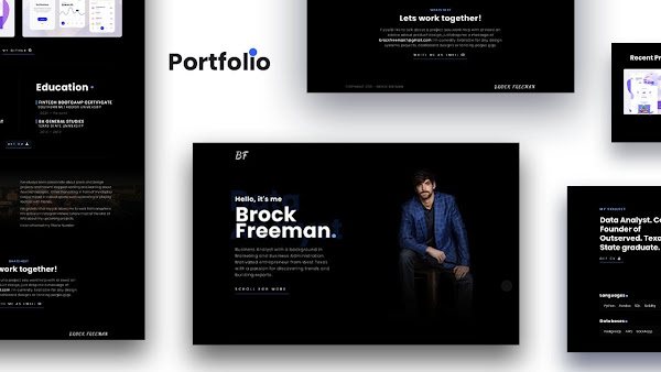
How To Create A Complete Portfolio Website Using HTML, CSS, and JS
- 00:00 - 03:00 min : Intro
- 04:00 - 102.00 min: Create A Complete Portfolio Website Using HTML, CSS, and JavaScript
This is the basic HTML which is important for all HTML files. I import Poppins in this HTML file using Styling from google because most people do not have Poppins font on their devices.
  <html>
<head>
<meta charset="utf-8">
<meta content="IE-edge" http-equiv="X-UA-Compatible">
<meta content="width=device-width, intial-scale=1.0" name="viewport">
<title>MHD - Full HD Movies</title>
	<!--style----->
	<style>
		body{
			font-family:poppins;
		}
	</style>

</head>

<body>
</body>
</html>
Website HTML
All CSS<!--doctype html--> <html> <head> <meta charset="utf-8"> <meta name="viewport" content="width=device-width, initial-scale=1.0"> <!--==Keywords=========================================================--> <meta name="keywords" content="Brock Freeman, Brock Freeman (BF), BF, Brock, Freeman, Freeman Brock, Data Analyst, Co-Founder of Outserved, Texas State graduate"> <!--==Title============================================================--> <title>Brock Freeman - Data Analyst</title> <!--==Meta-Description=================================================--> <meta name="description" content="Brock Freeman - Data Analyst, Co-Founder of Outserved, Texas State graduate, interested in innovative tech and the outdoors."> <!--==Stylesheet=======================================================--> <link rel="stylesheet" type="text/css" href="css/style.css"/> <!--==Fav-icon=========================================================--> <link rel="shortcut icon" href="images/fav-icon.png"/> <!--==Using-Font-Awesome-for-Icons=====================================--> <script src="https://kit.fontawesome.com/c8e4d183c2.js" crossorigin="anonymous"></script> <!--==Import-Font-Family-From-Google-Font======================--> <link rel="preconnect" href="https://fonts.googleapis.com"> <link rel="preconnect" href="https://fonts.gstatic.com" crossorigin> <link href="https://fonts.googleapis.com/css2?family=Poppins:ital,wght@0,100;0,200;0,300;0,400;0,500;0,600;0,700;0,800;0,900;1,100;1,200;1,300;1,400;1,500;1,600;1,700;1,800;1,900&display=swap" rel="stylesheet"> <link rel="preconnect" href="https://fonts.googleapis.com"> <link rel="preconnect" href="https://fonts.gstatic.com" crossorigin> <link href="https://fonts.googleapis.com/css2?family=Dancing+Script:wght@400;500;600;700&display=swap" rel="stylesheet"> <!--==CSS-Swiper==============================--> <link rel="stylesheet" href="css/swiper-bundle.min.css"/> <!--==AOS======================================--> <link rel="stylesheet" href="css/aos.css"/> </head> <body> <!--==scroll-progress-bar=================================--> <div id="progress"> <span id="progress-value"></span> </div> <div class="fix"> <!--==Navigation==============================--> <nav class="navigation"> <!--logo--> <div class="logo-container"> <a class="logo" href="index.html">bf</a> </div> </nav> <!--==main=====================================--> <section id="main"> <div class="main-bg"> <img alt="Brock Freeman - Data Analyst" src="images/BF_portrait.png"> </div> <!--text**********************--> <div class="main-text"> <strong>Hello, it's me</strong> <h1>Brock Freeman<span>.</span></h1> <p>Business Analyst with a background in Marketing and Business Administration. Motivated entrepreneur from West Texas with a passion for discovering trends and building reports.</p> <a href="#summery">Scroll For More</a> </div> <!--Images********************--> <div class="main-img"> <img alt="Brock Freeman - BF portrait" src="images/BF_portrait.png"> </div> </section> <!--==Summery=========================================--> <section id="summery"> <!--heading********************************--> <div class="summery-heading"> <strong>My Skillset</strong> <h2>Data Analyst. Co-Founder of Outserved. Texas State graduate.</h2> <a download="" href="cv/Updated_CV.pdf">Get CV <i class="fas fa-download"></i></a> </div> <!--==Details******************************--> <div class="summery-details" data-aos="fade-left" data-aos-duration="500"> <p>Business Analyst with a background in Marketing and Business Administration. Motivated entrepreneur from West Texas with a passion for discovering trends and building reports. Helped two small startups scale from hundreds to thousands of online users by using analytical tools and marketing campaigns on Hootsuite. Data-driven analyst with 4 years project management and business relations experience. In 2018, co-founded a mobile and web application called Outserved, which specializes in custom geo-fence marketing and data mining for local businesses. The ability to work with small to mid-sized databases and conduct detailed reports and insights to help scale a business, would be a strong addition to the team.</p> </div> </section> <!--==Languages===================================--> <section id="languages"> <div class="language-box" data-aos="fade-right" data-aos-duration="500"> <!--heading************************--> <h3>Languages<span>.</span></h3> <!--container**********************--> <ul> <li>Python</li> <li>Pandas</li> <li>SQL</li> <li>Solidity</li> </ul> </div> <div class="language-box" data-aos="fade-left" data-aos-duration="500"> <!--heading************************--> <h3>Software<span>.</span></h3> <!--container**********************--> <ul> <li>Hootsuite</li> <li>Tableau</li> <li>Jupyter</li> <li>Notebook</li> </ul> </div> <div class="language-box" data-aos="fade-right" data-aos-duration="500"> <!--heading************************--> <h3>Databases<span>.</span></h3> <!--container**********************--> <ul> <li>PostgresQL</li> <li>AWS</li> <li>Back4app</li> </ul> </div> </section> <!--==Process==============================================--> <section id="process"> <!--heading--> <div class="process-heading"> <h3>Process <span>+</span></h3> </div> <div class="process-container"> <div class="process-box" data-aos="fade" data-aos-duration="500"> <span>01</span> <strong>Pre-Process</strong> <ul> <li>Collect Informations</li> <li>Personas</li> <li>SetUp Goals</li> <li>Project Folder + Moodboard</li> </ul> </div> <div class="process-box" data-aos="fade" data-aos-duration="500"> <span>02</span> <strong>Low Fidelity</strong> <ul> <li>Whiteboard</li> <li>Maps Screen Info</li> <li>Possible States</li> <li>First Diagram</li> </ul> </div> <div class="process-box" data-aos="fade" data-aos-duration="500"> <span>03</span> <strong>Pre-Process</strong> <ul> <li>Moodboard</li> <li>First Diagram</li> <li>Write your copy</li> <li>Intern Test</li> </ul> </div> <div class="process-box" data-aos="fade" data-aos-duration="500"> <span>04</span> <strong>Assets & Delivery</strong> <ul> <li>CSpecifications</li> <li>Diagram</li> <li>Final Prototype</li> <li>Video x Notes</li> </ul> </div> <div class="process-box" data-aos="fade" data-aos-duration="500"> <span>05</span> <strong>Final & Test</strong> <ul> <li>Inspectlet x hotjar</li> <li>Mixpanel</li> <li>Google Analytics</li> <li>Intercom</li> </ul> </div> <div class="process-box" data-aos="fade" data-aos-duration="500"> <span>06</span> <strong>After Design</strong> <ul> <li>Goals</li> <li>Workspace</li> </ul> </div> </div> </section> <!--==Projects=============================================--> <section id="projects"> <!--heading-container******************************--> <div class="project-heading" data-aos="fade-right" data-aos-duration="500"> <h3>Recent Projects <span>+</span></h3> <!--btns=========================--> <div class="slider-btns"> <div class="swiper-button-prev"></div> <div class="swiper-button-next"></div> </div> </div> <!-- Slider============================================= --> <div class="swiper mySwiper" data-aos="fade" data-aos-duration="500"> <div class="swiper-wrapper"> <!--1================================--> <div class="swiper-slide"> <!--box=============--> <div class="project-box"> <a href="https://github.com/Bfree22/Outserved-Reports"> <img alt="Project" src="images/p-1.jpg"/> <!--over-layer--> <div class="p-ovrerlay"> <strong>Outserved Reports</strong> </div> </a> </div> </div> <!--2================================--> <div class="swiper-slide"> <!--box=============--> <div class="project-box"> <a href="https://github.com/Bfree22/EV_Sentiment_Trading"> <img alt="Project" src="images/p-2.jpg"/> <!--over-layer--> <div class="p-ovrerlay"> <strong>EV Sentiment Trading</strong> </div> </a> </div> </div> <!--3================================--> <div class="swiper-slide"> <!--box=============--> <div class="project-box"> <a href="https://github.com/Bfree22/Custom-portfolio-Risk-Return-Calculator"> <img alt="Project" src="images/p-3.png"/> <!--over-layer--> <div class="p-ovrerlay"> <strong>Portfolio Risk Simulator</strong> </div> </a> </div> </div> </div> </div> <!--dribble-btn******************************--> <div class="dribble-btn-c"> <a class="dribble-btn" href="https://github.com/Bfree22">My Github <i class="fab fa-github"></i></a> </div> </section> <!--==Career-Education===========================--> <section id="career-education"> <!--Career*****************************--> <div class="career" data-aos="fade-right" data-aos-duration="500"> <!--heading=============--> <h3>Career <span>+</span></h3> <!--container===========--> <div class="c-box-container"> <!--box================--> <div class="c-box"> <h4>Marketing Manager</h4> <strong>Agrellus</strong> <span>2019 – 2020</span> </div> <!--box================--> <div class="c-box"> <h4>Co-Founder / Business Analyst</h4> <strong>Outserved / Local LBK</strong> <span>2018 – 2019</span> </div> </div> </div> <!--Edu*****************************--> <div class="career edu" data-aos="fade-left" data-aos-duration="500"> <!--heading=============--> <h3>Education <span>+</span></h3> <!--container===========--> <div class="c-box-container"> <!--box================--> <div class="c-box"> <h4>Fintech Bootcamp Certificate</h4> <strong>Southern Methodist University</strong> <span>2021 – Parsent</span> </div> <!--box================--> <div class="c-box"> <h4>BA General Studies</h4> <strong>Texas State University</strong> <span>2016 - 2019</span> </div> </div> </div> </section> <!--==btn=========================================--> <div class="btn-c"> <a class="dribble-btn" download="" href="cv/Updated_CV.pdf">Get CV <i class="fas fa-download"></i></a> </div> <!--==About==============================================--> <section id="about"> <div class="about-container"> <!--heading*****************************--> <div class="about-heading" data-aos="fade" data-aos-duration="500"> <strong>ABOUT ME</strong> <h3>Designing with passion for Problem Solving</h3> <a href="tel:806-790-0683">806-790-0683 <i class="fas fa-phone"></i></a> </div> <!--details*****************************--> <div class="about-details" data-aos="fade" data-aos-duration="500"> <p>I’ve always been passionate about pixels and design projects and haven’t stopped working and learning about new technologies . Other than sitting in from of my display I enjoy myself in casual sports, such as bowling or playing football with friends.</p> <p>I'm grateful that my job allows me to work from anywhere. I’m active on Instagram where I share most of the and all info about my upcoming projects.</p> <p>I also attached my Phone Number</p> </div> </div> </section> <!--==contact============================================--> <section id="contact" class="contact" data-aos="fade" data-aos-duration="500"> <strong>WHATS NEXT</strong> <h3>Lets work together!</h3> <p>f you'd like to talk about a project you want help with or need an advice about product design, just drop me a message at <b>brockfreeman7@gmail.com</b> I'm currently Available for any design systems projects, dashboard designs or landing pages gigs.</p> <a class="contact-btn" href="mailto:brockfreeman7@gmail.com">Write Me An Email <i class="far fa-envelope"></i></a> </section> <!--==footer=============================================--> <footer> <span>Copyright 2021 - Brock Freeman</span> <a class="footer-logo" href="index.html">Brock Freeman</a> </footer> </div><!--Fix--> <!--==JS-Swiper====================================--> <script src="js/swiper-bundle.min.js"></script> <script src="js/aos.js"></script> <!--==script=======================================--> <script> /*Initialize Swiper*/ var swiper = new Swiper(".mySwiper", { slidesPerView: 1, spaceBetween: 10, pagination: { el: ".swiper-pagination", clickable: true, }, autoplay: { delay: 6000, disableOnInteraction: false, }, navigation: { nextEl: ".swiper-button-next", prevEl: ".swiper-button-prev", }, breakpoints: { 360: { slidesPerView: 1, spaceBetween: 20, }, 540: { slidesPerView: 1, spaceBetween: 20, }, 1200: { slidesPerView: 2, spaceBetween: 40, }, 840: { slidesPerView: 1.5, spaceBetween: 20, }, }, }); /*==scroll-animation==================================*/ AOS.init(); /*==scroll=progress=bar================================*/ let scrollPercentage = () => { let scrollProgress = document.getElementById("progress"); let progressValue = document.getElementById("progress-value"); let pos = document.documentElement.scrollTop; let calcHeight = document.documentElement.scrollHeight - document.documentElement.clientHeight; let scrollValue = Math.round( pos * 100 / calcHeight); scrollProgress.style.background = `conic-gradient(#689af8 ${scrollValue}%, #2b2f38 ${scrollValue}%)`; progressValue.textContent = `${scrollValue}%`; } window.onscroll = scrollPercentage; window.onload = scrollPercentage; </script> </body> </html>
*{
    margin: 0px;
    padding: 0px;
    font-family: poppins;
    box-sizing: border-box;
    scroll-behavior: smooth;
}
a{
    text-decoration: none;
}
ul{
    list-style: none;
}
body{
    margin: 0px;
    padding: 0px;
    font-family: poppins;
    background-color: #000000;
}
::selection{
    background-color: #3330fa;
    color: #ffffff;
}
/*===hide-Scroll-Bar==========================*/
body::-webkit-scrollbar {
    display: none;
}
body {
  -ms-overflow-style: none;  /* IE and Edge */
  scrollbar-width: none;  /* Firefox */
}
.fix{
width:100%;
overflow-x:hidden;}
/*scroll-progress============================*/
#progress{
    height: 50px;
    width: 50px;
    border-radius: 50%;
    position: fixed;
    bottom: 25px;
    right: 25px;
    box-shadow: 0 0 10px rgba(0,0,0,0.2);
    display: grid;
    place-items: center;
    z-index: 105;
}
#progress-value{
    display: block;
    height: calc(100% - 5px);
    width: calc(100% - 5px);
    background-color: #111111;
    border-radius: 50%;
    display: grid;
    place-items: center;
    font-weight: 600;
    font-size: 0px;
}
/*==Navigation====================================*/
.navigation{
    z-index: 200;
    position: fixed;
    left: 0px;
    top: 0px;
    height: 100px;
    display: flex;
    justify-content: center;
    align-items: center;
    width: 100%;
    background-image: linear-gradient( 180deg, #000, rgba(0, 0, 0, 0.8) 59%, transparent);
}
.logo-container{
    max-width: 950px;
    width: 100%;
    display: flex;
    justify-content: flex-start;
    align-items: center;
}
.logo{
    color: #ffffff;
    font-size: 2.4rem;
    text-transform: uppercase;
    font-weight: 700;
    letter-spacing: 3px;
    font-family: Dancing Script;
}
/*==main===============================*/
#main{
    max-width: 950px;
    width: 100%;
    display: flex;
    justify-content: space-between;
    align-items: center;
    margin: 90px auto 20px auto;
    border-bottom: 1px solid rgb(15, 15, 15);
    padding-bottom: 60px;
    position: relative;
}

.main-bg{
    display: none;
}
.main-img{
    max-width: 350px;
    max-height: 700px;
    width: 100%;
}
.main-img img{
    width: 100%;
    height: 100%;
    object-fit: contain;
    object-position: center;
}
.main-text strong{
    color: #ffffff;
    font-weight: 700;
    letter-spacing: 1px;
    font-size: 1.65rem;
    margin-bottom: 8px;
    display: flex;
    justify-content: flex-start;
}
.main-text{
    width: 400px;
    position: relative;
}
.main-text::before{
    content: 'Data Analyst';
    position: absolute;
    left: 50%;
    transform: translateX(-50%);
    top: -30px;
    font-size: 7rem;
    color: #296dff28;;
    line-height: 7rem;
    font-weight: 700;
    z-index: -1;
}
.main-text h1{
    color: #ffffff;
    font-size: 5rem;
    line-height: 4rem;
    letter-spacing: 1px;
}
.main-text h1 span{
    color: #689af8;
}
.main-text p{
    color: #999999;
    margin: 30px 0px;
    letter-spacing: 1px;
    font-size:1rem;
}
.main-text a,
.summery-heading a,
.dribble-btn,
.contact-btn,
.about-heading a{
    color: #ffffff;
    text-transform: uppercase;
    font-weight: 400;
    letter-spacing: 6px;
    font-size: 0.8rem;
    border-bottom: 1px solid #689af8;
    padding: 10px 10px 10px 0px;
    transition: all 508ms cubic-bezier(.77, 0, .175, 1);
}
.main-text a:hover,
.summery-heading a:hover,
.dribble-btn:hover,
.btn-c a,
.contact-btn:hover,
.about-heading a:hover{
    padding: 10px;
    background-color: rgb(104, 154, 248,0.1);
    transition: all 508ms cubic-bezier(.77, 0, .175, 1);
}
/*==summery===================================*/
#summery{
    display: flex;
    justify-content: space-between;
    align-items: center;
    max-width: 950px;
    width: 100%;
    margin:-20px auto 0px auto;
    padding-top:100px;
}
.summery-heading{
    max-width: 400px;
    width: 100%;
}
.summery-details{
    max-width: 470px;
    width: 100%;
    border: 1px solid rgb(14, 14, 14);
    padding: 20px;
}
.summery-heading strong{
    color: #689af8;
    text-transform: uppercase;
    letter-spacing: 3px;
}
.summery-heading h2{
    color: #ffffff;
    font-size:2.37rem;
    line-height: 2.9rem;
    margin: 20px 0px;
}
.summery-details p{
    color: #999999;
    font-size: 1rem;

}
/*==languages=========================*/
#languages{
    display: grid;
    grid-template-columns: 1fr 1fr;
    grid-gap: 30px;
    max-width: 950px;
    width: 100%;
    margin: 80px auto 50px auto;
    padding-bottom: 80px;
    border-bottom: 1px solid rgb(15, 15, 15);
}
.language-box{
    width: 100%;
    display: flex;
    flex-direction: column;
}
.language-box h3{
    font-size: 1.3rem;
    color: #ffffff;
    letter-spacing: 1px;
}
.language-box h3 span{
    color: #689af8;
    font-weight: 600;
    font-size: 4rem;
    line-height: 1.3rem;
}
.language-box ul{
    display: flex;
    background-color: #050505;
    padding: 10px 20px;
    border: 1px solid rgba(39, 39, 39, 0.4);
    margin-top: 10px;
    flex-wrap: wrap;
}
.language-box ul li{
    color: #dadada;
    margin-right: 20px;
    margin-top: 4px;
}
/*==process=================================*/
#process{
    width: 100%;
    max-width: 950px;
    display: flex;
    justify-content: center;
    flex-direction:column;
    align-items: center;
    margin: 50px auto;
    padding-bottom: 50px;
    border-bottom: 1px solid rgba(39, 39, 39, 0.4);
}
.process-heading{
    width: 100%;
}
.process-heading h3{
    font-size: 3rem;
    color: #ffffff;
    letter-spacing: 2px;
}
.process-heading h3 span{
    color: #689af8;
    font-size: 1.7rem;
}
.process-container{
    display: grid;
    grid-template-columns: 1fr 1fr 1fr;
    grid-gap: 100px;
    width: 100%;
    margin-top: 50px;
}
.process-box{
    display: flex;
    flex-direction: column;
    align-items: flex-start;
    position: relative;
}
.process-box span{
    color: #296dff28;
    position: absolute;
    left: -30px;
    top: -30px;
    font-weight: 700;
    font-size: 4rem;
    z-index: -1;
}
.process-box strong{
    color: #ffffff;
    font-size: 1.5rem;
    letter-spacing: 1px;
}
.process-box ul{
    margin-top: 20px;
}
.process-box ul li{
    color: #ffffff;
    font-size: 1.12rem;
    margin:8px 0px;
}

/*==projects================================*/
#projects{
    width: 100%;
    margin: 80px auto;
    padding-bottom: 50px;
    position: relative;
}
#projects::before{
    content: '';
    position: absolute;
    left: 50%;
    transform: translateX(-50%);
    bottom: 0px;
    max-width: 950px;
    width: 100%;
    height: 1px;
    background-color: rgba(39, 39, 39, 0.4);
}
.project-heading{
    width: 100%;
    max-width: 950px;
    display: flex;
    justify-content: space-between;
    align-items: center;
    margin: auto;
}
.project-heading h3{
    font-size: 3.1rem;
    color: #ffffff;
}
.project-heading h3 span{
    color: #689af8;
    font-size: 1.8rem;
}

.mySwiper{
    margin: 50px 0px;
    max-width:1050px;
}
.project-box{
    width:100%;
    height: 350px;
    border-radius: 10px;
    overflow: hidden;
    position: relative;
    background-color: #000000;
}
.project-box img{
    width: 100%;
    height: 100%;
    object-position: center;
    object-fit: cover;
}
.p-ovrerlay{
    position: absolute;
    left: 0px;
    top: 100%;
    width: 100%;
    height: 100%;
    display: flex;
    justify-content: flex-start;
    align-items: flex-end;
    background: rgb(32,32,32,0.5);
    background: linear-gradient(180deg, rgba(0, 0, 0, 0) 65%, rgb(0, 0, 0,0.85) 100%);
    padding: 30px 30px;
    transition: all ease 0.6s;
}
.p-ovrerlay strong{
    font-size:2rem;
    color: #ffffff;
    letter-spacing: 2px;
    border-left: 4px solid #689af8;
    line-height: 30px;
    padding-left: 20px;
    font-weight: 700;
}
.project-box:hover .p-ovrerlay{
    top: 0px;
    transition: all ease 0.6s;
}

.swiper-button-next,
.swiper-button-prev{
    position: static !important;
    transform: translate(0,0);
    margin: 10px 0px 0px 10px !important;
}
.slider-btns{
    display: flex;
    justify-content: flex-end;
    margin: 10px 0px 10px auto;
}
.swiper-button-next::after,
.swiper-button-prev::after{
    font-size: 20px !important;
    font-weight: 800;
    color: #ffffff;
}
.dribble-btn-c{
    display: flex;
    justify-content:center;
    align-items: center;

}

/*==career-education=========================*/
#career-education{
    display: flex;
    justify-content: space-between;
    align-items: center;
    max-width: 950px;
    width: 100%;
    margin:20px auto;
    position: relative;
}
#career-education::before{
    content: '';
    position:absolute;
    left: 50%;
    top: calc(50% - 30px);
    transform: translate(-50%,-50%);
    height: 100%;
    width: 1px;
    background-color: #141414;
}
.c-box-container{
    display: flex;
    flex-direction: column;
    margin: 10px 0px;
    width: 100%;
}

.career h3{
    display: flex;
    justify-content: flex-start;
    align-items: center;
    font-size: 3.1rem;
    color: #ffffff;
    letter-spacing: 1px;
    margin-bottom: 10px;
}
.career span{
    color: #689af8;
    font-size: 1.6rem;
    margin-left: 10px;
}
.c-box{
    display: flex;
    flex-direction: column;
    width: 100%;
    margin-top: 20px;
}
.c-box h4{
    font-size: 1.3rem;
    color: #ffffff;
    font-weight: 600;
    letter-spacing: 1px;
    text-transform: uppercase;
    border-left: 3px solid #689af8;
    padding-left: 10px;
    line-height: 1.3rem;
}
.c-box strong{
    color: #ffffff;
    font-size: 1rem;
    font-weight: 400;
    letter-spacing: 2px;
    text-transform: uppercase;
    padding-left: 10px;
}
.c-box span{
    color: #6d6d6d;
    font-size: 1rem;
    letter-spacing: 2px;
    padding-left: 10px;
    margin-top: 6px;
}
.btn-c{
    display: flex;
    justify-content: center;
    align-items: center;
    width: 100%;
    margin: 0px auto 50px auto;
    padding-bottom: 50px;
    max-width: 950px;
    border-bottom: 1px solid rgba(39, 39, 39, 0.4);
}
.btn-c a:hover{
    opacity: 0.8;
}
/*==about===============================*/
#about{
    width: 100%;
    display: flex;
    flex-direction: column;
    justify-content: center;
    align-items: center;
    margin-top: 30px;
    margin-bottom: 100px;
    background-image: url(../images/about-bg.jpg);
    background-position: center;
    background-repeat: no-repeat;
    background-size: cover;
    position: relative;
    padding: 50px 0px;
}
#about::before{
    content: '';
    position: absolute;
    left: 0px;
    top: 0px;
    width: 100%;
    height: 100%;
    z-index: 1;
    background: rgb(32,32,32);
    background: linear-gradient(180deg, rgba(0, 0, 0, 0.376) 60%, rgb(0, 0, 0) 100%);
}
#about::after{
    content: '';
    position: absolute;
    left: 0px;
    top: 0px;
    width: 100%;
    height: 100%;
    z-index: 1;
    background: rgb(32,32,32);
    background: linear-gradient(0deg, rgba(0, 0, 0, 0.376) 60%, rgb(0, 0, 0) 100%);
}
.about-container{
    display: flex;
    justify-content: space-between;
    align-items: center;
    max-width: 950px;
    width: 100%;
    z-index: 100;
    position: relative;
}
.about-heading{
    width: 380px;
}
.about-heading strong{
    color: #689af8;
    font-size: 0.87rem;
    letter-spacing: 1px;
    text-transform: uppercase;
}
.about-heading h3{
    color: #ffffff;
    font-size: 2.1rem;
    margin: 15px 0px;
    line-height: 2.8rem;
}
.about-details{
    width: 465px;
}
.about-details p{
    color: #999999;
    margin: 10px 0px;
}
/*==contact=============================*/
#contact{
    width: 100%;
    max-width: 950px;
    display: flex;
    flex-direction: column;
    justify-content: center;
    align-items: center;
    margin: 50px auto;
    text-align: center;
}
.contact strong{
    color: #689af8;
    font-size: 0.87rem;
    letter-spacing: 1px;
    font-weight: 600;
}
.contact h3{
    color: #ffffff;
    font-size: 2.37rem;
    letter-spacing: 1px;
}
.contact p{
    color: #999999;
    max-width: 640px;
    margin: 15px 0px;
    letter-spacing: 1px;
}
.contact p b{
    color: #ffffff;
    font-weight: 500;
}
/*==footer========================*/
footer{
    display: flex;
    justify-content: space-between;
    align-items: center;
    max-width: 950px;
    width: 100%;
    margin: 100px auto 0px auto;
    padding: 20px;
    text-align: center;
}
footer span{
    color: #6d6d6d;
    text-transform: uppercase;
    letter-spacing: 1px;
    font-size: 0.9rem;
}
footer .footer-logo{
    color: #ffffff;
    text-transform: uppercase;
    font-weight: 700;
    letter-spacing: 3px;
    font-size: 1.3rem;
    font-family: Dancing Script;
}
/*==making-resposive===============================*/
@media(max-width:1010px){
    #main,
    #summery,
    #languages,
    #process,
    #projects,
    .dribble-btn-c,
    #career-education,
    .btn-c,
    .about-container,
    #contact,
    .logo-container{
        width: 90%;
    }
}
@media(max-width:940px){
    #career-education{
        flex-direction: column;
    }
    #career-education::before{
        display: none;
    }
    .career{
        width: 100%;
        border-bottom: 1px solid rgba(39, 39, 39, 0.4);
        padding-bottom: 40px;
    }
    .edu{
        margin-top: 50px;
        border-bottom: none;
        padding-bottom: 20px;
    }
    .btn-c{
        justify-content: flex-start;
    }
    .btn-c a{
        width: 200px;
        display: flex;
        justify-content: center;
        align-items: center;
    }
}
@media(max-width:850px){
    #main{
        padding:40px 0px 70px 0px;
        min-height: 550px;
    }
    .main-img{
        display: none;
    }
    .main-bg{
        display: block;
        position: absolute;
        left: 50%;
        top: 50%;
        transform: translate(-50%,-50%);
        height: 500px;
    }
    .main-bg img{
        width: 100%;
        height: 100%;
        object-fit: contain;
        object-position: center;
    }
    .main-text{
        max-width: 100%;
        width: 100%;
    }
    .main-text h1{
        font-size: 4rem;
    }
    #summery{
        flex-direction: column;
    }
    .summery-details,
    .summery-heading{
        max-width: 100%;
    }
    .summery-details{
        margin-top: 40px;
    }
    #languages{
        grid-template-columns: 1fr;
    }
    .process-container{
        grid-template-columns: 1fr 1fr;
        width: 80%;
    }
    .about-container{
        flex-direction: column;
    }
    .about-details,
    .about-heading{
        width: 100%;
        max-width: 100%;
    }
    .about-details{
        margin-top: 40px;
    }
}
@media(max-width:500px){
    .navigation{
        height: 70px;
    }
    .logo-container{
        width: 85%;
    }
    .logo{
        font-size: 1.8rem;
    }

    #main{
        margin-top: 0px;
        padding-top: 100px;
    }
    .main-bg{
        display: block;
        position: absolute;
        left: 50%;
        top: 15%;
        transform: translate(-50%,-15%);}

    .main-text::before{
        font-size: 4rem;
        line-height: 3.5rem;
    }
    .main-text{
        display: flex;
        flex-direction: column;
        text-align: center;
        justify-content: center;
        align-items: center;
        margin-top: 100px;
    }
    .main-text strong{
        font-size: 1.3rem;
    }
    .main-text h1{
        font-size: 2.3rem;
        line-height: 2.3rem;
    }

    .process-container{
        grid-template-columns: 1fr;
        width: 90%;
    }
    .summery-heading strong{
        font-size: 1rem;
    }
    .summery-heading h2{
        font-size: 1.6rem;
        line-height: 1.9rem;
    }


.summery-heading a,
.dribble-btn,
.contact-btn,
.about-heading a{
    padding: 10px;
    background-color: rgb(104, 154, 248,0.1);
}
.summery-details{
    padding: 10px;
}
.language-box h3{
    font-size: 1.2rem;
}
.process-heading h3,
.project-heading h3,
.career h3,
.about-heading h3,
.contact h3{
    font-size: 2rem;
    line-height: 2.5rem;
}
.process-box strong{
    font-size: 1.3rem;
}
.project-box{
    height: 330px;
}
.c-box h4{
    font-size: 1.2rem;
}
.c-box strong{
    margin-top: 4px;
    font-size: 0.9rem;
}
}
@media(max-width:414px){
    .project-box{
        height: 230px;
    }
}
@media(max-width:320px){
    #main{
        padding-top: 40px;
    }

    .main-bg{
        display: block;
        position: absolute;
        left: 50%;
        top: -30%;
        transform: translate(-50%,30%);}
}


Comments