
How To Make A Personal Website Using HTML And CSS
Learn How To Make A Personal Website Using HTML And CSS. It Is Very Easy To Make A Personal Portfolio Website Template Using HTML For In This Tutorial, You Will Learn How To Make a Website Using HTML. It is a Very Awesome Website Template You Will Create By Using HTML And CSS. If You Want To Make a Personal Website Like This, Follow These Steps Which I Given Below.
How To Make A Personal Website Using HTML And CSS
- 0.0 - 1.30 min : Intro
- 1.30 - 1.28.0 min: Build Your Own Website HTML
Hey! In This Tutorial I Will Teach You How To Make a Personal Website Template Using HTML CSS And JavaScript.This Is Very Easy To Make This Portfolio Website. First 60s In This Tutorial Video, I Will Show You Which Website Design I Create In This Tutorial. Then I Will Create HTML, CSS, And Javascript Files And Put This Files In The Project Folder. After Creating, I Linked The CSS And Js File With HTML Using "Link" And "Script" Tags. This Website Depend Upon Five Sections.
- Main Section.
- About Section.
- Services Section.
- Portfolio Section.
- Contact Section.
I Will Create All This Section One By One. After Creating And Designing This Sections, I Make This Website Template Responsive Using Media Query. Hope You Like This Tutorial.
<!--doctype html-->
<html>
<head>
<meta charset="utf-8">
<meta http-equiv="X-UA-Compatible" content="IE-edge">
<meta name="viewport" content="width=device-width, intial-scale=1.0">
<title>Personal Website</title>
	<!--style----->
	<style>
		body{
			background-color:#161616;
		}
	</style>

</head>

<body>
</body>
</html>
Navigation

➤ Navigation HTML Code have given below.
<section id="main">
	<!--navigation-------------------------------->
	<nav>
	<!--logo--->
	<a class="logo" href="#">LOGO</a>
	<!--menu--------->
	<div class="toggle"></div>
	<ul class="menu">
	<li class="active"><a href="#main">Home</a></li>
	<li><a href="#about">About</a></li>
	<li><a href="#services">Services</a></li>
	<li><a href="#portfolio">Portfolio</a></li>
	<li><a href="#contact-form">Contact</a></li>
	</ul>
	<!--language-->
	<a class="lang" href="#">En</a>
	</nav>
 </section>
➤ Navigation CSS Code have given below.
body{
	margin:0px;
	padding:0px;
	background-color:#161616;
}
ul{
	list-style:none;
}
a{
	text-decoration:none;
}
#main{
	padding:30px 50px;
	position:relative;
	width:100%;
	height: 100vh;
	box-sizing: border-box;
	background-size: 1330px;
	background-position: right bottom;
	background-repeat: no-repeat;
	background-image: url("../images/bg.png");
	background-color: #edf1fd;
}
nav{
	display:flex;
	justify-content: space-between;
	align-items: center;
	text-transform: uppercase;
	font-weight: 600;
	letter-spacing: 2px;
	font-family: calibri;
	position: fixed;
	top: 0;
	left: 0;
	width:100%;
	box-sizing: border-box;
	padding: 10px 50px;
	background-color:#F4F7FF;
	box-shadow:2px 2px 12px rgba(0,0,0,0.05);
	z-index: 1;
}

.menu{
	display: flex;
}
.menu li a{
	padding: 10px 15px;
	color:#6c707c;
	font-size: 12px;

}
.lang{
	color:#292929;
}
.logo{
	font-size: 25px;
	font-weight: bold;
	color:#292929;
	font-family:Poppins;
}
.toggle{
	display: none;
}
.active a,
.menu li a:hover{
	background-color:#292929;
	color:#FFF!important;
	font-weight: bold;
	transition: all ease 0.4s;
}
Content

➤ Content HTML Code have given below.
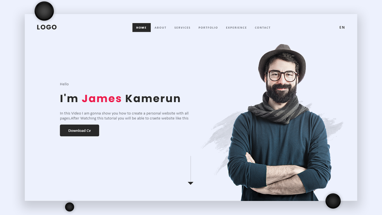
  <!--name--------------------------->
	<div class="name">
	<!--hello------->
	<p>Hello</p>
	<!--name--->
	<h1>I'm <font color="#17d1ac">James</font> Kamerun</h1>
	<!--details--------------->
	<p class="details">In this Video I am gonna show you how to create a personal website with all pages.After Watching this tutorial you will be able to craete website like this</p>
	<!--cv button-------------------->
	<a class="cv-btn" href="#">Download Cv</a>


	</div>
		<!--down arrow-------------->
	<div class="black-line" ></div>
	<!--social---------------->
	<div class="social">
	<a href="#"><i class="fab fa-facebook-f"></i></a>
	<a href="#"><i class="fab fa-twitter"></i></a>
	<a href="#"><i class="fab fa-instagram"></i></a>
	<a href="#"><i class="fab fa-youtube"></i></a>
	</div>
➤ FontAwesome Link Past in "Head" section.
  <head>
  <!--using FontAwesome---------------->
<script src="https://kit.fontawesome.com/c8e4d183c2.js" crossorigin="anonymous"></script>
</head>
➤ Content CSS Code have given below.
.name{
	font-family: calibri;
	width: 500px;
	position: absolute;
	left: 20%;
	top: 50%;
	transform: translate(-20%,-50%);
}
.name p:nth-child(1),.name .details{
	color:#6c707c;
	font-size: 16px;
}
.name h1{
	font-family:Poppins;
	font-size: 40px;
	margin:0px;
	letter-spacing: 3px;
	color:#292929;
}
.cv-btn{
	width:200px;
	height: 45px;
	display: flex;
	justify-content: center;
	align-items: center;
	background-color: #292929;
	color:#FFFFFF;
}
.cv-btn:hover{
	background-color: #131313;
	transition: all ease 0.5s;
}
.black-line {
  align-self: end;
  width: 50%;
  height: 15%;
  margin-bottom: 4em;
  position: absolute;
	bottom:0px;
	left: -3%;
	border-right: 1px solid  rgba(41,41,41,0.30);
}

.black-line::after{
  content: ' ';
  position: absolute;
  width: 0;
  height: 0;
  border-style: solid;
  border-width: 11px 11px 0 11px;
 border-color:  #292929 transparent transparent transparent;
  right: -.7em;
  bottom: -2px;
}


.social{
	position: absolute;
	left: 50px;
	bottom: 50px;
	display: flex;

}
.social a{
	margin: 6px 12px;

}
.social i{
	color:rgba(18,17,17,0.40);
	font-size: 14px;
}
.social a:hover i{
	color:#17d1ac;
	transition: all ease 0.5s;
}
About

➤ About HTML Code have given below.
  <!--about----------------------->
		<section id="about">
	<!--text---------------------->
	<div class="about-text">
	<h1>About Us</h1>
	<h2>FreeLancing FrontEnd Developer</h2>
	<p>Enjoy the ultimate web design editor. Divi is like Photoshop or Sketch for the web. It brings an advanced design interface to WordPress that both beginners and experts will fall in love with. It's incredibly smart, super flexible, amazingly powerful and visual by nature. This is how designing for the web is meant to be done.</p>
	<button>View More Details</button>
	</div>
	<!--about-model----------------->
	<div class="about-model">
	<img alt="model" src="images/about-model.png"/>
	</div>
	</section>
➤ Skills CSS Code have given below.
#about{
	width:100%;
	height: 100vh;
	background-color:#161616;
	box-sizing: border-box;
	display: flex;
	align-items: center;
	justify-content: space-between;
	padding: 50px 5% 0px 5%;
	position: relative;
}
.about-text{
	font-family: calibri;
	width: 50%;
}
.about-text h1{
	font-size: 5rem;
	color:#17d1ac;
}
.about-text h2{
	font-size: 3rem;
	color:#FFFFFF;
	font-weight: 400;
}
.about-text h1,h2{
	margin: 0px;
	padding: 0px;
}
.about-text p{
	font-size: 1.2rem;
	color:rgba(255,255,255,0.90);

}
.about-text button{
	width: 180px;
	height: 40px;
	border-radius: 20px;
	border: none;
	outline: none;
	background-color:#17d1ac;
}
.about-text button:hover{
	background-color: #FFFFFF;
	transition: all ease 0.3s;
}
Services

➤ Services Section HTML Code have given below.
  <!--services-------------------->
	<section id="services">
	<!--heading-------------->
	<div class="s-heading">
	<h1>Services</h1>
	<p>Here Is The Some Servies Which We Provide You.</p>
	</div>
	<!--services-box-container--------->
	<div class="b-container">
	<!--box-1---------------->
	<div class="s-box">
	<!--img------------->
	<div class="s-b-img">
		<!--type----------->
		<div class="s-type">Front-End</div>
		<!--name------->
		<img src="images/s1.png">
	</div>
	<!--text----------------->
	<div class="s-b-text">
	<a href="#">With Divi, every part of your website is customizable. You have complete freedom to create the perfect website for you or your clients. Easily change colors, fonts and text styles. Apply stunning animations.</a>
	</div>
	</div>
		<!--box-2---------------->
	<div class="s-box">
	<!--img------------->
	<div class="s-b-img">
	<!--type----------->
		<div class="s-type">Back-End</div>
		<!--name------->
		<img src="images/s2.png">
	</div>
	<!--text----------------->
	<div class="s-b-text">
	<a href="#">With Divi, every part of your website is customizable. You have complete freedom to create the perfect website for you or your clients. Easily change colors, fonts and text styles. Apply stunning animations.</a>
	</div>
	</div>
		<!--box-3---------------->
	<div class="s-box">
	<!--img------------->
	<div class="s-b-img">
		<!--type----------->
		<div class="s-type">SEO</div>
		<!--name------->
		<img src="images/s3.jpg">
	</div>
	<!--text----------------->
	<div class="s-b-text">
	<a href="#">With Divi, every part of your website is customizable. You have complete freedom to create the perfect website for you or your clients. Easily change colors, fonts and text styles. Apply stunning animations.</a>
	</div>
	</div>
	</div>
	</section>
➤ Services Section CSS Code have given below.
#services{
		width:100%;
	height:100vh;
	box-sizing: border-box;
	font-family: calibri;
	display: flex;
	flex-direction: column;
	align-items: center;
	justify-content: center;
	padding-top: 40px ;

}

.s-heading h1{
	color:#FFFFFF;
	font-size: 3rem;
	margin: 0px;
	padding: 0px;

}
.s-heading p{
	color:rgba(255,255,255,0.30);
	font-size: 1rem;
	margin: 0px;
	padding: 0px;
}
.s-heading{
	text-align: center;
	margin: 20px 0px;
}
.s-box{
	background-color: #2B2B2B;
	width:350px;
	height: 500px;
	margin: 20px;
	border-radius: 10px;
	overflow: hidden;
	box-shadow: 2px 2px 12px rgba(0,0,0,0.1);
	position: relative;
}
.b-container{
	display: flex;
	justify-content: center;
	align-content: center;


}
.s-b-img{
	width: 100%;
	height: 70%;

}
.s-b-img img{
	width:100%;
	height: 100%;

}
.s-b-text{
	width: 100%;
	height: 30%;
	background-color:#1E1E1E;
	display:flex;
	justify-content: center;
	align-items: center;
	text-align: center;
}
.s-b-text a{
	margin: 0px;
	color:#FFFFFF;
	font-size: 1.1rem;
	font-family: calibri;
	display: block;
    display: -webkit-box;
	max-width: 80%;
    -webkit-line-clamp: 4;
    -webkit-box-orient: vertical;
    overflow: hidden;
    text-overflow: ellipsis;
}
.s-b-text a:hover{
	color:rgba(255,255,255,0.50)
}
.s-type{
	font-family: calibri;
	color:#FFFFFF;
	background-color: #151515;
	padding: 10px 15px;
	position: absolute;
	top: 0px;
	left: 50%;
	transform: translateX(-50%);
	font-size: 18px;
	border-radius: 0px 0px 10px 10px;
	box-shadow: 2px 2px 12px rgba(0,0,0,0.2);
}
.s-box:hover{
	transform:translateY(-10px);
	transition: all ease 0.3s;

}
Portfolio

➤ Porfolio Section HTML Code have given below.
  .
  <!--portfolio------------------->
	<section id="portfolio">
	<!--heading----------->
	<h1 class="p-headind">Portfolio</h1>
	<!--portfolio-container------------>
	<div class="p-container">
	<!--portfolio-box-1-------->
	<div class="p-box">
	<!--text--------->
	<div class="overlay-text">
	<h1>Writting</h1>
	<p>Client Project</p>
	</div>
	<!--bg-img------------->
	<img src="images/w1.jpg">

	</div>
	<!--portfolio-box-2-------->
	<div class="p-box">
		<!--text--------->
	<div class="overlay-text">
	<h1>Ideas</h1>
	<p>Client Project</p>
	</div>
	<!--bg-img------------->
	<img src="images/w2.jpg">
	</div>
	<!--portfolio-box-3-------->
	<div class="p-box">
	<!--text--------->
	<div class="overlay-text">
	<h1>Music</h1>
	<p>Client Project</p>
	</div>
	<!--bg-img------------->
	<img src="images/w3.jpg">
	</div>
	<!--portfolio-box-4-------->
	<div class="p-box">
	<!--text--------->
	<div class="overlay-text">
	<h1>Time</h1>
	<p>Client Project</p>
	</div>
	<!--bg-img------------->
	<img src="images/w4.jpg">
	</div>
	<!--portfolio-box-5-------->
	<div class="p-box">
	<!--text--------->
	<div class="overlay-text">
	<h1>Creative</h1>
	<p>Client Project</p>
	</div>
	<!--bg-img------------->
	<img src="images/w5.jpg">
	</div>
	<!--portfolio-box-6-------->
	<div class="p-box">
	<!--text--------->
	<div class="overlay-text">
	<h1>Books</h1>
	<p>Client Project</p>
	</div>
	<!--bg-img------------->
	<img src="images/w6.jpg">
	</div>

	</div>
	</section>
➤ Client Section CSS Code have given below.
#portfolio{
	width:100%;
	box-sizing: border-box;
	font-family: calibri;
	display: flex;
	flex-direction: column;
	align-items: center;
	justify-content: center;
	padding: 60px 2% 20px 2%;
}

.p-headind{
	font-family: calibri;
	font-size: 1.7rem;
	text-align: center;
	color:#FFFFFF;
	font-weight: 400;
	padding: 10px 20px;
	background-color: #292929;
	letter-spacing: 2px;
	border-radius: 3px;
	box-shadow: 2px 2px 20px rgba(0,0,0,0.1);

}
.p-box{

	background-color: #1F1F1F;
	overflow: hidden;
	border-radius: 10px;
	box-shadow: 2px 2px 13px rgba(0,0,0,0.3);
	position: relative;

}
.p-box img{

width: 100%;
	height: 100%;
	object-fit: cover;
}
.p-container{
	width: 90%;
	height:70vh;
	display:grid;
	grid-template-columns:1fr 1fr 1fr;
	grid-template-rows: auto auto;
	grid-gap: 10px;
}
.overlay-text{
	font-family: calibri;
	position: absolute;
	left: 0;
	top: 0;
	width: 100%;
	height: 100%;
	display: flex;
	justify-content: center;
	align-items: center;
	flex-direction: column;
	background-color: rgba(23,209,172,0.80);
	display:none;

}
.overlay-text h1,p{
	color: #FFFFFF;
}
.overlay-text h1{
	font-size: 2.2rem;
	margin: 0px;
	padding: 0px;
	letter-spacing: 2px;

}
.overlay-text p{
	font-size: 1.2rem;
	margin: 0px;


}
.p-box:hover .overlay-text{
	display: flex;

}
Contact Button

➤ Contact Button Section HTML Code have given below.
  <!--Contact-btn------------------>
	<section id="contact-btn">
	<!--heading-------------->
	<h1 class="c-b-heading">If You Have Any Project In Your Mind ?</h1>
	<!--btn-------->
		<button >Contact Me</button>
	</section>
➤ Contact and Footer Section CSS Code is have given below.
#contact-btn{
	width: 100%;
	display: flex;
	flex-direction: column;
	justify-content:center;
	align-items: center;
	height: 200px;
	background-color: #F4F7FF;
	margin: 20px 0px;
	box-sizing: border-box;
	box-shadow:2px 0px 20px rgba(0,0,0,0.4);
}
.c-b-heading{
	font-size: 2rem;
	color:#1E1E1E;
	font-family: calibri;
	margin: 10px;
	padding: 5px;
	letter-spacing: 4px;
	border-bottom: 2px solid #1E1E1E;

}
#contact-btn button{
	color:#FFFFFF;
	font-size: 1rem;
	font-family: calibri;
	width:150px;
	height: 40px;
	margin: 10px;
	background-color: #1E1E1E;
	border: none;
	outline: none;
	box-shadow: 2px 5px 6px rgba(0,0,0,0.2);
}
#contact-btn button:hover{
	background-color: #17d1ac;
	color:#000000;
	transition: all ease 0.5s;
	font-weight: bold;
}
Contact Form

➤ Contact Section HTML Code have given below.
  <!--contact-form------------------->
	<section id="contact-form">
	<form>
	<!--left--------------------------------------->
	<div class="contact-left">
	<h1 class="c-l-heading"><font style="border-bottom: 3px solid #1ED98B;">Writ</font>e us</h1>
	<!--name-------->
	<div class="f-name">
	<font >Name</font>
	<input type="text" placeholder="Full Name"/>
	</div>
	<!--email-------->
	<div class="f-email">
	<font >Email</font>
	<input type="email" placeholder="Example@gmail.com"/>
	</div>
	</div>
	<!--right------------------------------------------->
	<div class="contact-right">
	<!--message-------->
	<div class="message">
	<font >Message</font>
	<textarea name="message" rows="5" cols="20" placeholder="Write Message..."></textarea>
	</div>
	<!--submit-btn------------>
	<button>submit</button>
	</div>

	</form>
	</section>
➤ Contact and Footer Section CSS Code is have given below.
#contact-form{
	width: 100%;
	height: 90vh;
	display: flex;
	justify-content: center;
	align-items: center;

}
#contact-form form{
	display: flex;
	width: 70%;
	height: 60vh;
	background-color: #1A1A1A;
	box-shadow: 2px 12px 20px rgba(0,0,0,0.2);
	border: 1px solid rgba(255,255,255,0.01)
}

.contact-left{
	width: 40%;
	height: 100%;
	display: flex;
	flex-direction: column;
	align-items: center;
}
.contact-right{
	width: 60%;
	height: 100%;
	box-sizing: border-box;
	display: flex;
	flex-direction: column;
	justify-content: space-between;
	border-left: 1px solid rgba(255,255,255,0.08);
}
.contact-right button{
	width: 100%;
	height: 50px;
	background-color: #1ED98B;
	font-weight: bold;
	outline: none;
	border: none;
	margin: 0px;
	color:#1B1B1B;
	font-size: 14px;
	text-transform: uppercase;
	letter-spacing: 2px;

}
.c-l-heading{
	font-family: calibri;
	color:#FFFFFF;
	font-size: 3rem;
	letter-spacing: 2px;
	font-weight: 400;

}
.f-name,.f-email{
	display: flex;
	flex-direction: column;
	font-family: calibri;

}
.f-name font,.f-email font{
	color:#BFBFBF;
	font-size: 22px;
}
.f-name input,.f-email input{
	height: 30px;
	width:250px;
	border: none;
	outline: none;
	background-color:transparent;
	border-bottom: 1px solid #929292;
	color:#FFFFFF;
	margin: 10px 0px;
}
.f-email input::placeholder,
.f-name input::placeholder{
	opacity: 0.5;
	letter-spacing: 1px;
}
.f-email input:focus,
.f-name input:focus{
	border-bottom: 1px solid #17d1ac;
	transition: all ease 0.5s;
}.message font{
	font-size: 18px;
	color:#4E4E4E;
	font-family: calibri;

}
.message{
	margin: 20px;
}
.contact-right textarea{
	width: 100% !important;
	height: 320px !important;
	border: none;
	outline: none;
	background-color:transparent;
	box-sizing: border-box;
	color:#EBEBEB;
	font-size: 16px;
}
.contact-right textarea::placeholder{
	color:#EBEBEB;
	font-size: 18px;
	letter-spacing: 2px;
	font-family: calibri;
}
.contact-right button:active{
	transform: scale(1.04);
	transition: all ease 0.1s;
}
Make Responsive

➤ JQuery Code Past in the End of the Body tag.
  <script type="text/javascript" src="js/JQuery3.3.1.js"></script>
	<script type="text/javascript">

		  /*Responsive Navigation*/
	  $(document).ready(function(){
	 $('.toggle').click(function(){
		 $('.toggle').toggleClass('active')

		 $('nav ul').toggleClass('active-menu')


	 })
 });

	</script>
➤ Responsive CSS Code is have given below.
@media(max-width:1190px){
	#main{
		background-size: 1150px !important;

	}
	.name{
		left: 10%;
		top: 50%;
		transform: translate(-10%,-50%);
	}
	.about-model img{
		height:400px;
	}
	#services{
		height:auto;
	}
	.b-container{
		flex-wrap: wrap;
	}
	.s-box{
		flex-grow: 1;
	}
	.s-b-img img{
		object-fit:cover;
	}
	#contact-form form{
		width:95% !important;
	}

}
@media(max-width:970px){
	#main{
		background-image: none !important;

	}
	.name{
		left: 50%;
		top: 50%;
		transform: translate(-50%,-50%);
	}
	.about-model{
		display: none;
	}
	#about{
		justify-content: center;
		padding-top: 0px;
	}
	.about-text{
		width: 90%;
	}
	.about-text h1{
		font-size:4rem;
	}

	.p-container{
		width:100%;

	}

}
@media(max-width:900px){
	.toggle{
			display:block;
		}
		.toggle:before{
	content:'\f0c9';
	font-family: fontAwesome;
	line-height: 0px;
			margin-left:-30px;
}
		.toggle.active:before{
	content:'\f00d' !important;

		}
	nav{
		padding:10px 30px;
	}

	nav ul{
		position:absolute;
		width: 100%;
		height:auto;
		box-sizing:border-box;
		background-color:#0F0F0F;
		top: 50px;
		left: 0;
		transition: 0.5s;
		overflow: hidden;
		display: none !important;
		border:3px solid #1F1F1F;
	}

		nav ul li a{
		border-bottom: 1px solid rgba(255,255,255,0.10) ;
		color:#ffffff !important;
		width: 100%;
		height: 50px;
		display: flex;
		justify-content: center;
		align-items: center;
		margin: 0px !important;
		padding: 0px !important;
	}
		nav ul{
			padding:0px;
			margin:0px;
		}

		.active-menu {
		display: block !important;
	}

		nav ul li a:hover{
			background-color:rgba(27,29,32,0.15);

			}


	.p-container{
		grid-template-columns:1fr 1fr;
	grid-template-rows:auto;
	grid-gap: 10px;
		height: auto;
	}
	.c-b-heading{
		font-size: 1.4rem;
		text-align: center;
	}
	#contact-form{
		padding: 20px;
		height: auto;
		box-sizing: border-box;
	}


	#contact-form form {
		flex-direction: column;
		height:auto;
		padding: 20px;
		width:90% !important;

	}
	.contact-left,.contact-right{
		width:100%;
		border: none;
	}
	.f-name,.f-email{
		width: 100%;

	}
	.f-name input,.f-email input{
		width:100%;
		border: none;
		background-color: #262626 !important;
		padding: 10px;
		box-sizing: border-box;
		height: 40px;

	}
	textarea{
		background-color: #262626 !important;
		margin: 10px 0px;
		padding: 10px;
		height: 200px !important;
		width:100% !important;
	}
	.message{
		margin:0px;
	}
	#contact-form form h1{
		margin:5px 0px;
	}


}

@media(max-width:600px){
	.p-container{
		grid-template-columns:1fr ;
		grid-template-rows: auto;}
	.c-b-heading{
		font-size: 1.2rem;
		text-align: center;
		margin: 0px 10%;
	}
	.name{
		width:60%;
	}


	.black-line{
		margin-bottom: 20px;
	}
	.social{
		left: 30px;
		transform: translateX(-10px);
	}
}
@media(max-width:400px){
	.s-box{
		width: 100%;
		height:400px;
	}
}


How to downlode source code
ReplyDeleteimg source??????????
ReplyDelete😃
ReplyDeleteimg
ReplyDeletewhere is the images?
ReplyDeleteI provide you full project file which I create in this tutorial. Just click on blue color text (build your own website. Rar), download the file and enjoy. All files available in this zip file
DeletePage Blocked. Please share source code.
Deletebro, please upload the img,,,
ReplyDeleteThank you so much dude
ReplyDelete