
How To Create a Parallax Scrolling Effect Website In HTML
Learn How to Make a Parallax effect Website Using HTML, CSS, And JavaScript(JS). Easy Way To Create A Parallax effect Website Using HTML, CSS, and JS. It is easy to create. You will make this Parallax Effect scrolling website by following the video tutorial or by following the steps which I have given below.
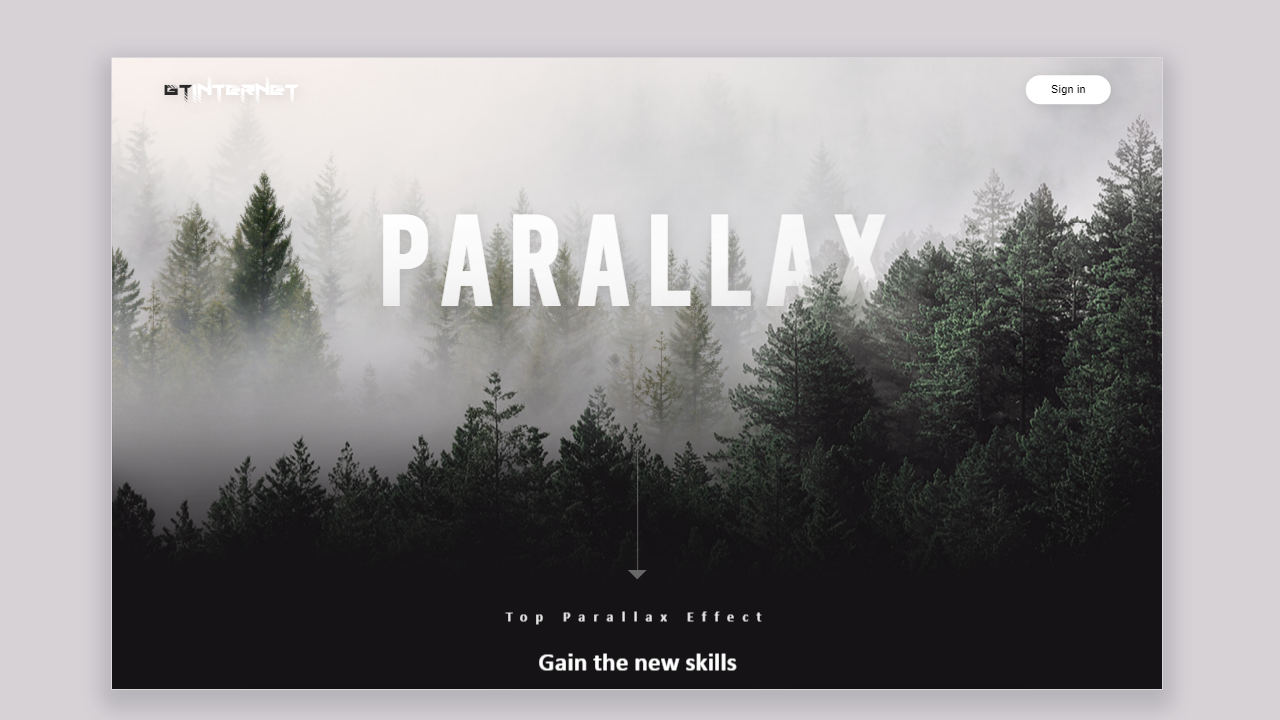
How To Make a Parallax Scrolling Effect Website In HTML, CSS, And JavaScript
- 0.0 - 1.00 min : Intro
- 1.0 - 18.00 min: Building A Parallax Effect Website Using HTML CSS and Javascript
Learn How to Make a Parallax Effect Website Using HTML, CSS, and JavaScript(JS). In the first 60s in the video tutorial, I will show you the design which I will create in this video. After, I will start to build a Parallax Scrolling Effect website Using HTML, CSS, And JavaScript(JS). I will Use Some Plugins For the Parallax effect. After Creating The Site, I will make this website Responsive Using CSS "@media" Query. Source Code download link I have Given Above the Post. I Hope You Like This Tutorial. If You have any questions or any problems with these tutorials, contact me.
1) Open any code editor.
2) Create HTML, CSS, And Javascript files and put in your project folder which you create. I recommended you to create separate folders for CSS File And JS File.
3) Link the CSS and JS File With HTML File.
4) Copy the HTML code, which I gave below, and paste in the HTML which you create.
<!--doctype html-->
<html>
<head>
<meta charset="utf-8">
<title>Parallex Effect</title>
<link rel="stylesheet" type="text/css" href="css/style.css">
</head>

<body>

	<!--parallex-layers-->
		<div class="layer-container">
			<div class="sky layer lax" data-lax-translate-y="0 1, 400 -100" ></div>
			<h1 class="parallex-text">PARALLEX</h1>
	<div class="montains layer lax"  data-lax-translate-y="0 1, 400 -260"></div>
		<div class="line lax" data-lax-opacity="0 1, 100 0"></div>

	</div>
	<!--nav---------------->
		<nav>
		<!--logo-->
		<a class="logo" href="#"><font color="#2A2929">GT</font>Internet</a>
		<!--menu-->
		<button>Sign in</button>

		</nav>


	<section class="categories lax" data-lax-translate-y="0 0, 400 -300" >
	<div class="heading">
		<h4>Top Prallex Effect</h4>
		<h1>Gain the new skills</h1>
		</div>
	<div class="products">
	<!--box-1---------------->
	<div class="box-1">
	<font>Montains</font>
	</div>
	<!--box-2---------------->
	<div class="box-2">
	<font>Architecture</font>
	</div>
	<!--box-3---------------->
	<div class="box-3">
	<font>Lanspace</font>
	</div>
	</div>
	</section>
	<!--script--------------------------->
	<script src="js/lax.js" type="text/javascript"></script>
	<script src="js/script.js" type="text/javascript"></script>
</body>
</html>
5) Copy the CSS code, which I gave below, and paste in the CSS which you create.
CSS
@charset "utf-8";
/* CSS Document */
body{
	margin:0px;
	padding:0px;
	background-color:#151315;

}
*{
	box-sizing:border-box;
}
ul{
	list-style:none;
}
a{
	text-decoration:none;
}
section{

}
.layer-container{
	position: relative;
	height:100vh;
	width:100%;
	transform-style: preserve-3d;
	overflow: ;


}
.layer{
	position: absolute;
	left:0;
	bottom: 0;
	top:0;
	right:0;

}
.sky{
	background-image:url("../images/dave-PDfe7H5GJR0-unsplash.jpg");
	background-repeat: no-repeat;
	background-position: center;
	background-size:cover;

}
.montains{
	background-image:url("../images/mountains.png");
	background-repeat: no-repeat;
	background-position: center;
	background-size:cover;

}
.parallex-text{
	font-size:150px;
	font-weight:bold;
	font-family:bebas kai;
	letter-spacing:15px;
	position:absolute;
	left:50%;
	top:20%;
	transform:translate(-50%,-20%);
	color:#FFFFFF;
 text-shadow:2px 2px 12px rgba(0,0,0,0.1);

}
nav{
	position: absolute;
	top:0px;
	width: 100%;
	display: flex;
	padding:40px 5%;
	justify-content:space-between;
	align-items: center;
}
.logo{
	color:#FFFFFF;
	font-family:RoadTest;
	font-size:30px;
	text-shadow:2px 2px 12px rgba(0,0,0,0.1);
}
.categories{
	height:50vh;
	background-color:#151315;
}
button{
	width:100px;
	height:34px;
	outline:none;
	border:none;
	background-color:#ffffff;
	border-radius:30px;
	color:#000000;
	box-shadow:2px 2px 12px rgba(0,0,0,0.1);
}
button:active{
	transform: scale(1.1);
}
.heading{
	display:flex;
	flex-direction: column;
	align-items: center;
}
.heading h1,h4{
	font-family: calibri;
	color:#ffffff;
	line-height:10px;


}
.heading h4{
	font-size:16px;
	letter-spacing:10px;
	opacity:0.9;
}

.heading h1{
	font-size:30px;
}
.products{
	display: flex;
	justify-content: center;
	margin:40px 5%;

}
.box-1,.box-2,.box-3{
	width:300px;
	height:400px;
	margin:10px;
	position: relative;
	box-shadow:2px 2px 12px rgba(0,0,0,0.5);


}
.box-1::after{
	content:'';
	position: absolute;
	bottom:0px;
	background:linear-gradient(0deg,#000000 20%,transparent);
}
.box-1{
	background-image: url("../images/paris-1080x1920-france-europe-5k-19437.jpg");
	background-position: center;
	background-repeat:no-repeat;
	background-size: cover;
}
.box-2{
	background-image: url("../images/2.png");
	background-position: center;
	background-repeat:no-repeat;
	background-size: cover;
}
.box-3{
	background-image: url("../images/3.jpg");
	background-position: center;
	background-repeat:no-repeat;
	background-size: cover;
}
.box-1 font,.box-2 font,.box-3 font{
	position: absolute;
	bottom:0px;
	color:#FCFCFC;
	width: 100%;
	letter-spacing:10px;
	text-align: center;
	background:linear-gradient(0deg,#151315 0%,transparent);
	height:30px;

}
.line {
  align-self: end;
  width: 50%;
  border-right: 1px solid white;
  height: 20%;
  margin-bottom: 4em;
  position: absolute;
	bottom:5px;
}
.line::after {
  content: ' ';
  position: absolute;
  width: 0;
  height: 0;
  border-style: solid;
  border-width: 11px 11px 0 11px;
  border-color: white transparent transparent transparent;
  right: -.7em;
  bottom: -2px;
}
6) Copy the JS code, which I give you below of this, and paste this code in the CSS which you create.
JavaScript
window.onload = function() {
            lax.setup() // init

            const updateLax = () => {
                lax.update(window.scrollY)
                window.requestAnimationFrame(updateLax)
            }

            window.requestAnimationFrame(updateLax)
        }
7) All Files link, Which I use in the project given below.
The Download Links Will Be Shown in 30 Seconds


Comments